Catch Up With Our Business Handlers to Discover Efficient Solutions.
Get Started 
Catch Up With Our Business Handlers to Discover Efficient Solutions.
Get Started
13-Jul-2023
In today's digital landscape, having a website that seamlessly adapts to mobile devices is crucial. With the growing number of individuals relying on their smartphones and tablets to browse the internet, businesses must prioritize mobile optimization. A responsive website design is the key to ensuring your site is accessible and functional across various devices, from mobile phones and tablets to desktop computers. In this article, we will explore the importance of responsive website design and how it can help you effectively engage with mobile users, ultimately converting them into paying customers.
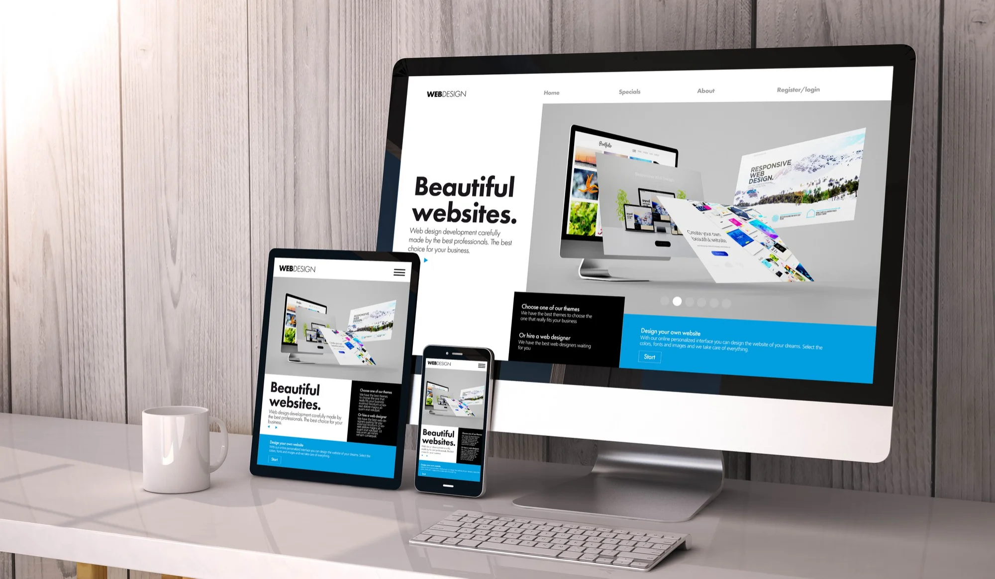
Responsive website design is an approach that focuses on developing websites capable of adjusting to different screen sizes and resolutions. By employing responsive design principles, the layout and content of a website automatically adapt to fit the specific screen dimensions of the device being used. This results in a user-friendly experience, regardless of whether the site is accessed via a mobile device, tablet, or desktop computer.
As indicated by Statista, the worldwide count of mobile phone users is estimated to reach 7.33 billion by 2023. This surge in mobile internet usage highlights the criticality of having a mobile-friendly website. Failing to optimize your website for mobile devices can hinder potential customers from seamlessly navigating and engaging with your content, ultimately resulting in missed opportunities.
Responsive website design ensures an improved user experience for mobile users. A mobile-friendly website offers easy navigation, legible content, and eliminates the need for users to zoom or scroll horizontally. These factors contribute to a seamless browsing experience, encouraging visitors to spend more time on your site, interact with your content, and significantly increase the likelihood of conversion.
Google, the prominent search engine, has explicitly endorsed responsive website design as the recommended mobile configuration. This endorsement holds significant weight as it can directly impact your website position on SERPs. By prioritizing mobile-friendly websites in search results, Google enables improved visibility, ensuring that you can effectively reach and engage a broader mobile audience.
A mobile-friendly website directly correlates to increased conversion rates by providing an optimal user experience. When visitors can effortlessly navigate your website on their mobile devices, they are more inclined to engage with your content, complete purchases, or submit contact forms. By delivering a seamless mobile experience, a responsive website design enables you to convert a higher percentage of your visitors into paying customers.
To make your website responsive, you can either hire a website design and development agency to create a custom responsive design, or use a responsive website template. A responsive website template is a pre-built design that adjusts automatically to different screen sizes and resolutions. If you're on a budget, using a responsive website template can be a more cost-effective solution.
A responsive website design is essential for reaching mobile users and improving your user experience. By providing a mobile-friendly website, you can increase your visibility in search engine results pages, improve your conversion rates, and reach more potential customers. Regardless of whether you're embarking on a new website creation journey or updating an existing one, prioritizing mobile optimization is crucial. By ensuring your website is fully optimized for mobile devices, you can cater to the needs of mobile users and significantly increase your chances of converting visitors into paying customers.
If you're ready to make your website responsive and reach more mobile users, contact us today to learn how our website design and development services can help. Our team of experts can help you create a custom responsive design that meets your business goals and engages your target.